I engaged a design team to create a new logo and redesign two of my websites, including this blog. I learned 7 things I needed to do to get the best results in the redesign process.

I worked with Mike Kim who is a marketing and communications consultant. We created a brand strategy that included redesigning my websites (this blog and Creative Results Management), creating new resource guides to prompt people to subscribe, editing copy on the sites, and a new logo.
Mike and graphic designer Jason Clement are not the first designers I’ve worked with. I’ve done this process several times for book covers and product logos with other designers. This time around was the best experience yet. And it had as much to do with changes in me as it did the excellent work that Mike and Jason did. I want to share 7 things I learned working with designers.
First, though, let me share what we created together. You are experiencing the website redesign right now. I hope you like the lighter, more friendly feel. To illustrate the 7 things I learned in this process, I’ll focus on the new logo.
The New Logo
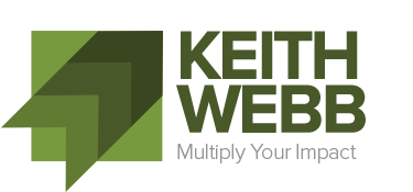
 Logos have meaning. Well designed logos express the values and vision of the organization. Here’s the meaning behind my new logo:
- The dominant image is a series of arrows, which indicate progress and vitality.
- The various shades of the arrows imply stages of learning as well as multiplication.
- If the box was an X / Y graph, the top right is the point of convergence, the result we seek.
- The arrows point up metaphorically toward God, the source of all transformation.
- The tail of the arrows allude to “out the box” thinking.
- The box and the arrows form a checked check box, indicating accomplishment and results.
- The green color scheme evokes growth, progress, multiplication, health, practicality, and results for me and my customers.
What values does your logo design express? How well does it express the values and vision of your organization?
7 Things I Learned Working With The Designers
Design is an intensely personal and emotional process. The process brings out my impatience. I’m more of a word-oriented person than an image-oriented person so I just want the design completed. Yet, I am difficult to satisfy. I learned 7 things that made the process a pleasant experience with great results.
- Get clear on your values. No designer can express for you what you don’t know yourself. What are your values? It’s okay that a couple are more aspirational rather than actual, but real values are what you’ll deliver to customers. And you want your design to indicate what you will deliver. I knew my key operating values: growth, practicality, multiplication, results, and fun.
- Get clear on your vision. What are you trying to accomplish? I was less clear on this. The designers quickly picked up on my coaching and coaching training work. They sent designs that illustrated people in conversation. That’s part of it, but not the root. My vision is not coaching, it’s equipping leaders to continue growing, develop other people, and multiply a positive impact in the world. Coaching is one element of accomplishing this vision.
- Let the designers design. Logos are very personal. Over the years I’ve rejected at least 100 potential logos from various designers. This time around I gave the designers freedom to create, then specific feedback on individual elements of the logos that I liked and didn’t like.
- Talk with the designers. Design is as much emotional as anything else. Don’t limit your communication to email. Mike and I had regular calls together to talk about what I liked and didn’t like. He asked probing questions to get beyond my preferences to draw out my values, then refocused the design in that direction.
- Listen to the designers. I also listened to the thoughts and rationale of the designers. For example, I didn’t care for the first draft of a logo with multiple arrows. Mike explained the concept of several arrows indicating growth and multiplication. We played with the shape, color, and background of the arrows, and it became central to the design.
- Ask others, but your vote counts most. I see social media posts that read, “which logo do you prefer?” It’s good to get feedback from others, particularly your customers. However, for that feedback to be useful those voting must understand your values and where you are going with your organization. What we miss most from voting is why they like or don’t like it. It’s easy to be a critic. I’ve never seen 3 designers agree on the same logo!
- Don’t worry, be happy. There is no perfect logo. I really like my new logo, but it is not end-all of my business. It’s a dynamic representation of me and my organization. I’ll use it for the next few years, then refresh it. Even Starbucks has only a 10-year average on its logo. Get something you like, something with meaning, and go with it.
I am really happy with my new logo and website design. It represents me well. I will now forget about logo and website design and re-focus my efforts on delivering on the promises we embedded into the meaning of this design.
Check out Mike Kim’s podcast called Brand You and download a free copy of his 34-page DIY Blog Guide which contains copywriting templates, video tutorials, and personal brand strategies.
Question: What have you learned that improved the design process? You can leave a comment by clicking here.


Keith, thanks so much for the public affirmation of our work! Jason and I were honored to work with you in your business and so glad you’re happy with the results. We enjoyed working with you as much as you did with us! (In fact, that gives me an idea for a future blog post …)
Enjoy!
Thanks Mike. I look forward to much more collaboration.
Very helpful, Keith. Thanks for sharing the customer side of this process.
Thanks John!
Hey Keith, the logo and website look great and communicates the essence of your service well. Mike and Jason are excellent with strategy, copy and design.
Thanks Rob! I enjoyed working with Mike and Jason.
Keith, what sort of “probing questions” did Mike and Jason ask to get past your preferences and draw out your values?
Mike asked questions like:
What do you like about your current logo, website, color scheme?
What don’t you like about your current logo, website, color scheme?
What are keywords for the results you deliver?
How would you describe your customer?
What elements of this [new] design appeal to you?
What about the design doesn’t appeal to you?
Great post!!
Great tips! However, the vast majority of people don’t understand these basic things. Thanks for sharing.
Hey Keith, I must say the logo and website are absolutely fantastic! They effectively capture the essence of your service and convey it brilliantly. I have to give credit where it’s due—Mike and Jason have done an outstanding job with strategy, copy, and design. They truly excel in their respective fields.